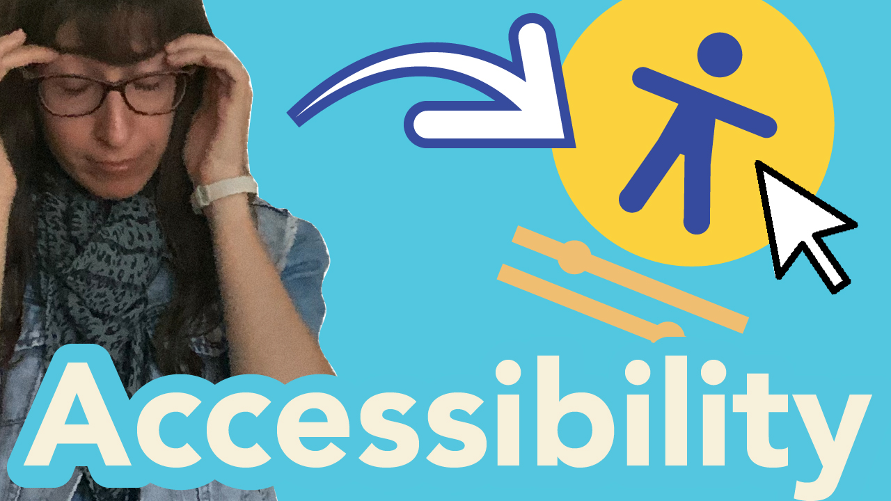
Have you ever felt frustrated navigating a website, or had potential clients not stay on your art therapy website? You were left thinking why didn’t they stay? The number one reason that they might not be sticking around is poor user experience and art therapy accessibility. Elements are not accessible on your art therapy website that is causing them to feel frustrated. Today I’ll be addressing five myths around accessibility and how you can start implementing art therapy accessibility to your website.
The myths I’ll be sharing will eliminate any kind of exclusivity within your communication materials, it’s time to bring a lot of inclusiveness to website work especially when it comes to user experience. There’s a lot of myths around not needing accessibility and not needing to focus on that area. I want to assure how much accessibility is going to be a priority in all businesses and the world in the next ten years. This is what the world is striving for, so why not get ahead now to address these problems when it comes to meeting accessibility needs. The focus is creating the best experience on your website to stop frustration. Everything needs to be easy, efficient, and simple so let’s go, we’re going to start with myth number one.
Myth Number One: Accessibility Is Only For People With Disabilities
Myth number one in regards to accessibility is basically it’s only for people with disabilities but that’s not true accessibility benefits everyone. It’s going to help with being efficient and get from point A to point B in a snap of a finger, everything needs to be smooth and easy to find. The focus of accessibility is to eliminate any stress or frustration when it comes to navigating a website and this is about inclusivity. In terms of these new changes happening in the world regarding more of the broader picture here around inclusiveness, learning about of neurodivergent individuals, individuals who need simpler ways to read, or individuals that have troubles seeing certain colours so they need high contrast. Lastly, those who are highly sensitive when there’s too much content on the page and need screen readers.
How can you make it even simpler?
There’s so many different needs when it comes to reading, digesting information or just navigating in general. Some need tools beyond a keyboard and a mouse to make the experience of browsing a website effortlessly. When designing your art therapy website, think about, how can you make the experience simple and easy to use?
Think about the different minorities within the world because again we are becoming more inclusive as a community and collective. We don’t want to exclude anybody, so when it comes to accessibility it matters to make everything effortless and as simple for all. Try to thinking about addressing all these different specific needs.
You have to ensure that everyone has the best experience possible, do your best, I mean you you’re not going to try and meet every person’s needs and try to fill each basket of eggs. But taking baby steps further into accessibility and prioritizing this area, creates a clean experience for getting to your next page, accessing a video, or downloading a freebie.
You’re making the process super simple in the communication realms. There’s so many different tools out there to bring in more accessible elements and create easier functionality when trying to get from point A to point B. You will be one step closer to taking away those barriers that are preventing you from getting clients.
Myth Number Two: Accessibility Only Affects A Small Amount Of Users
Myth number two about accessibility is that it only affects a small amount of users and that is also false because as we’re proceeding through our day-to-day life, things are getting busier and busier. It’s tough to just open a laptop to open up a website, everybody’s on the go, everybody’s on their phone. Most likely they would be scrolling on websites on their phones. It’s important to design your art therapy website on a mobile layout first. This means to starting with designing your website to fit the phone before going to the computer version because people are on the go they want easy access to your website.
Mobile First Design
If you approach it this way you are creating a actual website that fits well on the phone and functions super crisp and efficiently on the phone. That’s one tip I can tell you in terms of understanding the importance of focusing on the phone and only that. I mentioned before the world is constantly moving everyone is going here, there, and everywhere. They’re constantly changing environments, they could be in a noisy environment or it could be in a quiet environment. Time is the of the essence in this day and age, so ensure that there is quick access to everything. This individual could be using your website for listening to your podcast on your website, so ensure that audio is adjustable and the player is functional. Let’s just say they’re in a noisy environment and they can still hear your podcast those small details matter.
When it comes to someone who is using a screen reader to read your blog post, ensuring that sound is working and can be adjustable and changeable (via voiceovers) on your website. This great for someone who is listening to your blog post on the go and read your website while they’re on a train or while they’re shopping you never know.
Another thing to be fully aware of is the loading time on your website when individual’s are on the go, doing all these different things. The internet connection could vary in their travels. When you’re designing your art therapy website be mindful of the loading time on your website. Below are website URLs that help you test out your actual website speed time, so thats the first step in implementing accessibility. You evaluate your current website status and then make adjustments.
Accessibility Resources
💪 Page Speed Tester
Websites PageSpeed Insight
https://pagespeed.web.dev/
Google Analytics: https://marketingplatform.google.com/about/analytics/
🌐 Accessibility Testing Websites
Accessibility Checker:
https://www.accessibilitychecker.org/ WAVE Web Accessibility
Evaluation Tools:
https://wave.webaim.org/
Web Content Accessibility Guidelines: https://www.accessibilitychecker.org/guides/wcag/
WCAG Color Contrast Checker:
https://venngage.com/tools/color contrast-checker
💻Photo Editor Canva:
https://www.canva.com/photo-editor/
pixlr:
https://pixlr.com/x/
Photopea:
https://www.photopea.com/
Fotor:
https://www.fotor.com/
Mobile Friendly Test:
https://www.lambdatest.com/mobile-friendly-test
Loading Times
The next part to look at in creating faster loading times on your art therapy website is looking at your images. Do they load slow when you refresh the page or hit the buttons (Apple command + R or Ctrl + R on PC) for a hard refresh?
If so then you need to size your images to the actual size you need them, and need to be downsized to suit the web. Sometimes when we’re uploading images we usually upload them at their largest size. We actually want to upload the picture to the size and resolution that we actually needed for the website, and that alone will bring a lot more space to your website to load.
This will reduce lag when loading your website when they’re on the go. Most of the time if a page takes forever to load, the user does not have time to stare at their phone screens in hopes that your picture will show up. Your banner and your bio image. Below I will link some tools where you can test out your website. I believe its a good idea to connect your website to Google Analytics because it will track your performance and action that your website is receiving. Your art therapy website has to be super fast because people aren’t going to stick around if it’s so slow to loading especially when on the phone.
Myth Number Three: Making A Website Accessible Is Too Complicated
Myth number three, making a website accessible is too complicated and it really isn’t all that bad. You have to do things slowly and start implementing the changes. You’re not going to be able to get it done in one go. You will need to build on it because it is a process but it can be done in couple different stages.
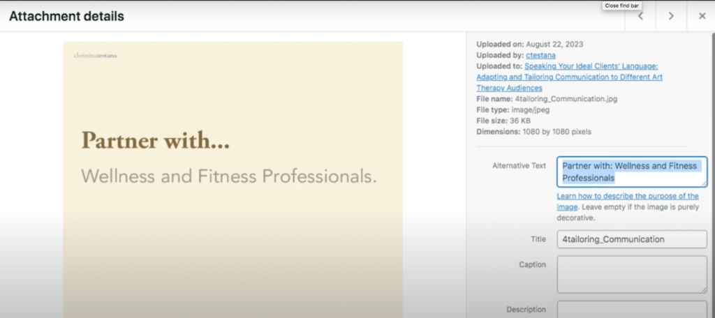
The first step that you could take today is going through all of your pictures and putting an ALT tag on them. If you don’t know what an ALT tag is, it’s basically a written version describing what the image is. You’re writing a descriptor for the screen readers and for Google. For example, if someone can’t see the image, the screen readers can help them visualize it in their minds via the screen reader. It can read the alt text that describes your image, so that’s a great way to meet one need. You now know you others might need the tools to understand your website.
It’s a win/ win with these alt tags because it helps you in your search engine optimization via Google indexing your page. When Google scrolls your page they’re going to pick up those alt tags and it helps you get noticed! It’s a win-win situation here when it comes to bringing accessibility to your website.
Colour Test
Another thing that you could do to start making changes today on your website is looking at your colours. Are your colours contrasting enough? It brings in visual interest but structure to your website to know, this is a separate section and this is a different section to a different topic. It’s helping to organize the information, what belongs to which category.
When it comes to identifying what contrast looks like take a screenshot of of your website. Using any photo editor that you have, you can change the photo into grayscale. It tells you whether there’s contrast or not.
What I mean by this is when you transform the screenshot into grayscale, you can see if some of your colours are blending together. Let’s say you see they’re are two gray blocks beside each other. Both the same shade of gray, then you know that’s a contrast problem. When you see something that’s a bit lighter than the colour next to it, then you know the contrast is there but not noticeable enough.
You want to push it further, then yes you could definitely strive for a lighter colour here so that where a stronger noticeable contrast should be introduced here. The other colour you can make a little darker. That’s a little tactic in terms of creating a little bit more contrast on your website.
Examples
Another easy fix that you could do is look at your navigation, do you have maybe too many tabs in your menu. Menu should have five tabs at the safest, if you have too many tabs that go right across the screen, it comes off too overwhelming. If you have drop-down menus, I would be careful with how many you use because the idea is no more than two clicks onto another page. If you’re going to get the user to keep clicking and clicking and clicking it’s just going to get a little bit too much for them. They want it simple so try to make page navigations as simple as possible. If you can cut it down to one to two clicks, that would make it a whole lot easier on user experience.
Myth Number Four: It’s Expensive To Make Your Website Accessible
Myth number four, it’s expensive to make your website accessible. Yes to a certain extent. I feel that if you take some time to learn about accessibility, it will save you time in the long run.
Start with the basic steps that I mentioned in the first point, then you’re already on your way to making the changes and making things more accessible. If things are a little too technical then yes you might have to ask ask for some assistance. There are solutions and tools out there that will help with bringing more accessibility to your site.
You need to identify where you need to put your attention towards, whether it’s you slimming your text, making your images smaller those are all great steps to get you started. Look to other videos out there that you could watch and educate yourself a little bit more in accessibility. Skillshare and YouTube might have good resources to address different areas to look at. Of course as a web designer, you know you can always ask me for assistance in my brand therapy coaching and feedback session.
Establish best practices
Implementing best practices as a start to accessibility is a good first step. When it comes to you designing your pages you should be more conscious about how you’re posting content. How you’re wording things and how you’re breaking up paragraphs.
This starts moving towards making things a little bit more easier to read. Adjusting your fonts, changing your image styles and maybe you’re changing your colour to make them more contrasty. These are all great steps to start implementing and even if you look to add-ons for your website. There’s probably some free add-ons out there that could help you start implementing some accessibility functionality.
This could be like font size changes, a menu that shrinks for phone, a screen reader, or language translator. As you proceed through developing your art therapy website much more, you can make the adjustments as you go. This is not a marathon this is more of a journey into hobbling into accessibility and making things much more easier.
Myth Number Five: Accessibility Is A Burden To Businesses
My fifth myth is accessibility is a burden to businesses. Not quite, actually it’s going to save your business big time because accessibility is also actually linked to search engine optimization. If you make the effort into putting in time to make your website accessible and easy to find and easy to navigate.
Google is going to have the best time searching and scrolling through your website because now they’re able to really understand you clearly and find things easier of course. This stretches your reach when it comes to you finding your audience and actually being recognized. It makes you look good as a business because this is about reputation as well, so if you’re putting in the work and making your website as easy and effective as possible.
You’re going to get some really good attention points because you are putting in the effort and the time. People will love you for that. They see that you do care about your people and what the user will feel when jumping on to your website.
As I mentioned before, this is going to boost your SEO your search engine optimization because you are establishing more keywords into your content and you’re really being descriptive with your words so you’re going to be found easier. It’s going to boost your awareness and that’s a really smart move to make as a business. To strive in the area of accessibility and being found easier that’s a dream for an art therapist business owner. Those are the five myths when when it comes to accessibility.
Wrap it up
I just want to reiterate the five big takeaways from this post that you could take with you today and start implementing accessibility elements into your website.
Number one
Accessibility is not only for people with disabilities, it is for everyone the collective. It’s going going to make things so much easier and it’s going to be more of a universal design, universal language and communication is going to be so much easier that way.
Number two
Inaccessible websites have more of a broader problem than you think. I mentioned everybody is on their phones using the websites, so it is a huge problem and it affects everybody not just a small percentage of people. Be aware of putting mobile first when website designing.
Number three
Common accessibility challenges have practical solutions. Like fixing large images making them a bit more smaller and more optimized for websites is a great step in the right direction. Even focusing on colours, making sure that there’s enough contrast between the lightest colour and the darkest colour for an easy read.
Number four
If you want to make your website accessible it doesn’t have to break the bank, there are so many tools online that are free to use and I’ll link them in this post. You can have a look and see if you can implement them into your website and at the least cost.
Number five
Establishing better practices and accessibility is not a burden at all. It’s actually a strategic advantage for art therapy businesses to boost their reputation to create better experiences and people will love you for that.
Comments
One response to “Captivate Art Therapy Users: Expert UX Tips for Longer Stays!”
[…] If they’re merging together that means there’s not enough contrast. (see my other blog) https://cmtdsgn.com/art-therapy-accessibility-myth-exclusion/ Push to make the colour more lighter or darker in your colour tones. Then you’re on a path of […]