

In the ever changing world of the digital realm, where every stroke matters, have you ever wondered if your art therapy website truly in-sync with the evolving pulse of technology? Picture this: People on the go carrying a huge computer strapped to their backs to stay connected.
Seems silly and irrational right?
Yes, this did happen in the 1970’s but our world has drastically evolved. Things have picked up in pace and were on the go constantly now a days. Time is tight and the need for small computer screens in our pockets is much more practical. We have entered a new revolution in technology called the Mobile First Reality. Our attention is now designing website for phone screens.
It’s time to step out of designing your art therapy website for computers and focus on designing for the phone as your primary. In the realm of art therapy website user experience challenges, where does your website stand? Is it modern? Does it have a phone version? Are you ready to break free from this fixation of only caring for desktop website design and discover the untapped potential that awaits your unique vision?
Let’s carve out your digital niche in a world that hungers for the beauty only art therapists can bring. I am unravel the myths, navigating the challenges, and delve into the heart of Mobile First Reality. Your art therapy business will thank you for making this transition and become a digital masterpiece—let the adventure begin!
Mobile First vs. Desktop Dominance
The first myth is desktop dominance, why do we still move to that direction of designing for larger screens? They look nice and they look pleasing on the eye but I think we need to be more practical here. As I mentioned we as human beings nowadays are on the go constantly and larger screens doesn’t really matter now. It’s actually more the focus of smaller screens that are more practical for on the-go experiences.
The focus is more on mobile experiences when it comes to designing a website and an app.
Focus your energy on mobile website designs and less on the desktop. I’m not saying that to completely exclude it but your focus should be first designing for the phone. Design for the phone first, it’s going to look pretty good on the desktop too, this is called responsive design. It means that when you’re designing anything for the web that it can adjust when going small to when going large.
Think of it as an elastic band.
It makes things a whole lot easier when designing in general because you’re establishing a Universal Design system for your website, when the site is adjusting from a small screen to a larger screen it will be seamless. But remember, most of us are accessing things through the phone than any other device. Be mindful of that when designing because I do see designers online selling website templates to therapists, but they only show the desktop version of the website. This makes me ponder and say “no, we need to focus on mobile website templates because that’s what’s essential right now.” Everyone goes to their phones and if there’s problems with those templates being functional on the phones, than I would question buying them. Those templates might not be mobile-friendly.
Desktop vs Mobile
This debate between desktop vs mobile, I believe there is still a need for both but the focus falls heavily on mobile. Now, there is another thing to consider and this would be your ideal client. It’s important to know their online behaviour because this can mask out how you should be designing your website and where to put most of your energy. If your audience are more older people that prefer desktop then you would make sure that’s essential. A younger audience, I guarantee will go for the phones. This would immediately tell you what should be the priority for your website.
Mobile User Experience Challenges
Myth number two, the principles of web design apply to all devices. This is actually false! The phone version need different approaches and come with their own principles that apply to this screen size and orientation. I’ll share why. Have a look at the illustration below.
Visual example of a website computer version

I’m going to draw this out to make this a lot easier so let’s just say we have a compter version of a website done. You have the logo up in the corner and then you have the menu bar on the right, and then a beautiful banner image with maybe a call to action button. This is landscape for computer screens.
Visual Example of a website in phone version
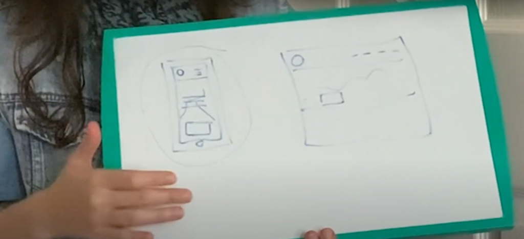
Designing for the phone, you don’t have a landscape view because the phones design is portrait view. So here’s your phone, it’s a completely different interactive experience. The principles that apply on a desktop screen is certainly different than the phone. It holds less space to show elements when you’re designing. The need to remove elements from the phone is key for use ability. This can stay on computer version of the website. Things like the banner people hide on phones because its hard to see. But your logo will always fit up in the right corner or maybe it’s in the center.
Principles change on each device
These common principles change on the phones because you have to accommodate for interactions with your finger when you’re touching the buttons. They need to be sized for a thumb to fit. Finger scrolling is different functionality compared to scrolling with a mouse. Accessing the navigator menu on the phone will be minimized to an icon with three lines in the top right hand corner of the phone. This is called a stacked menu so when you click on that menu, it’s going to expand to a full page and display the different pages.
Compared to the computer version where you just go to the right hand corner and click on the page you want. There’s more steps to take on the phone for navigation. As for that image banner you have to make the banner smaller to be seen and the call to action button 2 times bigger than on the computer version. It needs enough room for a finger to press the button.
Your your banner text might need to be more simplified so it doesn’t run all the way down the page. Need to consider size and the amount of text being shared on the splash page for the phone. Accommodate for different behaviours and when you’re designing for the phone first, this is the essential foundation in website design. Then go to the desktop version afterwards. It’s much easier to design for the desktop. I would say 80/20 rule for this. 80% of your energy goes to designing for the phone because this is where everyone goes to browser for access something.
Keep in mind the different behaviors people would take on a phone
Keep in mind the different behaviors people would take on a phone because whatever you do on the phone is different when you’re clicking with a mouse on the desktop version. Phone is all about tapping, so you’re tapping and scrolling. This is what I mean when comes to designing for mobile first, address the complex things that way the functionality is solid. Then you can go back and make it all pretty because that is essentially easy part. This approach to website design makes your site a responsive website that would automatically stretch out like an elastic band from the phone version to the computer version. This flexibility will create such fluidity in your website!
Enhancing User Experience Across Devices
Myth number three is that the user experience doesn’t matter. Well it actually does because your website is talking to a person, isn’t just about making a website because it makes you look great. It can’t just look “nice” it has to function properly or else people will only see it as an aesthetic and not so much as a practical tool.
When it comes to really caring about user experience and its challenges you really want to look at navigation, the loading times, and how your information is being spread out across the page.
Those are all essential points to start, and when you look at each of those pieces you need to ask yourself, how can this be even better?
What areas can be improved or can it be done better? You can take these questions with you and ask a family member, a friend or a favourite client as they navigate your website. I would highly recommend doing this, they will give you their honest responses. This will give you an idea of the direction in where to make adjustments and create a better experience for your people.
If one of your pieces of feedback was “your navigation is confusing” when you hear this, that means you need to simplify your navigation system. Now you have a stepping stone of what you need to do here.
Now in terms of loading times , they will for sure tell you “this is too slow” can you make this faster?” When it comes to loading times, there’s definitely things to look for. Your pictures is a good place to start because that essentially is usually the problem. You load big images that really don’t need to be that big. You can size them and adjust the resolution exactly to how you need them and this is called optimization. It means that you are optimizing for the web and not saving out as something you will print on paper. High resolution images are important to have but can be slightly adjusted to work favorably in the space that you need it.
Now another thing to look for is the responsive design, as I mentioned before when your design is being stretched to each of the different screen sizes. You want to make sure that each of your elements, like buttons, text boxes, navigation menu bars, are behaving right on each screen. I’ve seen websites where for some reason when it’s loaded on the computer, the menu bar goes into the phone version of the menu bar. Then when they go to the actual phone it’s the other way around. The computer version of the menu is on the phone which is not very helpful. These are detailed oriented things and being very attentive to those elements will boost the performance.
In Conclusion…
I’m now going to share the five key takeaways that you can bring with you to your art therapy website design.
Number One, User Behavior Shift.
You need to recognize that users nowadays are using their phones more than ever. When it comes to designing your website, be sure to do the phone first then your computer desktop. If you want to design for iPad, I would leave that one as a third option because what’s really essential is the phone. The computer as the second one and the iPad is not as common but people do use it. It’s going to depend on your ideal in the end.
Number Two, Responsive Design is a non-negotiable.
You can’t just design only for your computer screens. Apply responsive design to your art therapy website so its flexible and bends to meet each screen size. To needs to look good and function well on each screen size, so its seamless.
Number Three, Performance Matters.
Functionality always takes priority over the aesthetics. People care about the performance of a website and the ease of navigation. They want to ensure content and pages load quick, so can get the information they need. Anything slow will turn potential clients away. Hook up your website to Google Analytics and do a Page Speed Insight test every two weeks to a month. Making this part of your routine gives you times to adjust your images, content or any add-ons that could be taking up loading time. In terms of add-ons, see if you can find lighter versions or possibly add more storage on your website and server. These add-ons can range between a store plugin like shopify, or a scheduler like Acuity.
This gets really technical, so we won’t touch that right now. The easiest steps to take to make your website faster is adjusting your images and videos. They usually take up a lot of the loading time.
Number Four, Make elements thumb-friendly.
What I mean by the thumb-friendly is that because we’re designing for the phones you must remember that the user is not using a mouse to click anything on the mobile phone. Prioritize our fingers and thumbs, design for the biggest finger which is out thumbs. This will determine how big the buttons have to be when pressing anything on your website.
Your navigation menu should be stackable and be expandable on your phone, so that they could tap whatever they need to tap in the menu with their fingers or thumbs.bThis removes frustration and not clicking the wrong menu button. The point is to relieve any stress when it comes to navigating.
Number Five, Test Test Test
My last one here is test test test because your website is a work in progress. I’m going to tell you that right now. It’s dynamic forever changing and evolving. You’re going to need to continuously reach out to your ideal client, audience and maybe a family member to test your website, test the forms that you put on your website, test your shopping carts, test your videos that are on there, test the readability, and test how the images load.
All of this matters! You have to continue to test test test and do this on a quarterly basis because you never know what could change within the quarter with your website. It helps to improve the performance of your website and hence performance matters to all users that are hopping onto your website. Diving into your content and collecting value. They’re always looking for value but if they can’t get to the value, they will immediately close your website. This can be a potential customer that you have lost. Please take these into account.
Those are the five takeaways that I have for you today when it comes to designing for mobile first. Start implementing a mobile first website for your brand today with all the things that I shared in today’s post!
Comments
87 responses to “Colour Outside the Desktop: Art Therapists, Embrace Mobile First Reality for Your Unique Canvas!”
u.s. pharmacy prices for cialis
u.s. pharmacy prices for cialis
cialis for women
cialis for women
where to get my prescription cialis filled
where to get my prescription cialis filled
aciclovir in pharmacy
aciclovir in pharmacy
hong kong pharmacy ambien
hong kong pharmacy ambien
800mg viagra
800mg viagra
how many years can you take cialis?
how many years can you take cialis?
when will cialis become generic
when will cialis become generic
viagra price usa
viagra price usa
where to buy cialis over the counter
where to buy cialis over the counter
best online pharmacy advair
best online pharmacy advair
can i buy sildenafil over the counter in uk
can i buy sildenafil over the counter in uk
150 mg viagra
150 mg viagra
can i buy viagra in uk
can i buy viagra in uk
generic viagra 50mg
generic viagra 50mg
viagra medicine price in india
viagra medicine price in india
buy viagra uk pharmacy
buy viagra uk pharmacy
cialis overnight delivery
cialis overnight delivery
cialis diabetes
cialis diabetes
tadalafil powder suppliers
tadalafil powder suppliers
tadalafil (exilar-sava healthcare) [generic version of cialis] (rx) lowest price
tadalafil (exilar-sava healthcare) [generic version of cialis] (rx) lowest price
flagyl mrsa
flagyl mrsa
cymbalta+vs+neurontin+for+fibromyalgia
cymbalta+vs+neurontin+for+fibromyalgia
bactrim skuteczność
bactrim skuteczność
valacyclovir heartburn
valacyclovir heartburn
tamoxifen trials
tamoxifen trials
how does lyrica cause weight gain
how does lyrica cause weight gain
metformin history
metformin history
myxedema lasix
myxedema lasix
lisinopril complications
lisinopril complications
semaglutide and constipation
semaglutide and constipation
semaglutide zum abnehmen
semaglutide zum abnehmen
0.1 ml semaglutide
0.1 ml semaglutide
weight gain with zoloft
weight gain with zoloft
flagyl cholesterol
flagyl cholesterol
escitalopram clonazepam
escitalopram clonazepam
can i take benadryl with cymbalta
can i take benadryl with cymbalta
fluoxetine hcl 10 mg en español
fluoxetine hcl 10 mg en español
what are the side effects of lexapro
what are the side effects of lexapro
cephalexin for tonsillitis
cephalexin for tonsillitis
keflex and breastfeeding kellymom
keflex and breastfeeding kellymom
generic prescription viagra
generic prescription viagra
gabapentin cocrystals
gabapentin cocrystals
duloxetine walmart pharmacy
duloxetine walmart pharmacy
does ciprofloxacin make you urinate more
does ciprofloxacin make you urinate more
cephalexin vs bactrim
cephalexin vs bactrim
bactrim gram negative coverage
bactrim gram negative coverage
does bactrim treat trichomoniasis
does bactrim treat trichomoniasis
does amoxicillin cause yeast infection
does amoxicillin cause yeast infection
augmentin 875 price
augmentin 875 price
felix contrave
felix contrave
how much is citalopram without insurance
how much is citalopram without insurance
sulfa allergy and flomax
sulfa allergy and flomax
effexor for migraines
effexor for migraines
diclofenac dosage
diclofenac dosage
medications depakote
medications depakote
diltiazem dosage
diltiazem dosage
ezetimibe ultrasound study
ezetimibe ultrasound study
methocarbamol vs flexeril
methocarbamol vs flexeril
cozaar vs lisinopril
cozaar vs lisinopril
allopurinol interactions
allopurinol interactions
aripiprazole medication
aripiprazole medication
amitriptyline
amitriptyline
does advil have aspirin
does advil have aspirin
ksm 66 ashwagandha
ksm 66 ashwagandha
buspar side effects go away
buspar side effects go away
mobic vs celebrex
mobic vs celebrex
celexa vs paxil
celexa vs paxil
what is celecoxib taken for
what is celecoxib taken for
bupropion hair loss
bupropion hair loss
side effects of augmentin 875 mg
side effects of augmentin 875 mg
does abilify make you gain weight
does abilify make you gain weight
how long for protonix to work
how long for protonix to work
semaglutide heart failure
semaglutide heart failure
robaxin menstrual cramps
robaxin menstrual cramps
side effects of remeron
side effects of remeron
pbs actos
pbs actos
acarbose vidal
acarbose vidal
simultaneous estimation of repaglinide and metformin
simultaneous estimation of repaglinide and metformin
synthroid iodoral
synthroid iodoral
buy ivermectin
buy ivermectin
tamsulosin best time to take it
tamsulosin best time to take it
spironolactone mp 35
spironolactone mp 35
ebay buy voltaren 2% topical solution
ebay buy voltaren 2% topical solution
dapagliflozin sitagliptin metformin
dapagliflozin sitagliptin metformin
tizanidine hcl 2mg tabs
tizanidine hcl 2mg tabs
difference between venlafaxine and desvenlafaxine
difference between venlafaxine and desvenlafaxine